
Like the Force, and like duct-tape, the new digital media of science publishing have two sides. There is an admirable, encouraging trend for research reports to provide access to the experimental data with links to an archive. Over on the Dark Side, though, freed from the pressure of page space to enforce discipline and difficult choices, Figures are bloating out into unstructured, unselective omnium-gatherums. Multiple panels form a smorgasbord of cell-biology methods, depicting all aspects of an experiment in different plotting techniques, with no unifying theme or graphical coherence: grasping the logic of any one panel brings you no closer to understanding the next one.
A homing system targets therapeutic T cells to brain cancer

The paper holds out the prospect of effective immunotherapy of otherwise-intractable brain cancers, by redesigning immune cells for better penetration of the blood-brain barrier. Spotting its potential as a source of citations and an adornment to the journal's reputation, the Nature editors singled it out for headlines in the News and Views column ("T cells engineered to home in on brain cancer"), and extending the cruise-missile metaphor, as a Research Highlight in the Nature Immunology section ("Missile guidance for brain tumors"). With so many institutions claiming credit for it, the press release was circulated and went
In an Update on October 25 the paper acquired the Scarlet Letter of Shame in the form of an
The critical discussion thread at PubPeer is currently up to 46 comments. It began on October 16 -- six weeks after the publication date of September 6 -- when 'Gymnopilus Purpureosquamulosus' observed the presence, within the line-ups of fluorescent murine corpses, of some identical-twin pairs of mice.

The reuse of a few mouse portraits could be an innocent error, from researchers paying too little attention to mouse individuality. This is Nature, so duplicated images could in fact be convergent evolution. But the commentator also remarked on many other repetitions within the Figures. Subsequent commentators explored further connections, and alternative methods of dramatising the data-integrity concerns. I have picked out a few subthreads.
Readers come to 'For Better Science' expecting to see dodgy Western-Blot electrophoresis gels, and I am happy to oblige. G. Purpureosquamulosus pointed out a triplicated lane within Supplementary Figure S2A, supposedly representing the expression of three different proteins:

'Leucanella Acutissima' extended this to Figure S2A, noting that "Many of the lane similarities are partly obscured by vertical or horizontal squishing, or by flipping", while increasing the contrast of both images with a pseudocolour gradient map to emphasise the replications.
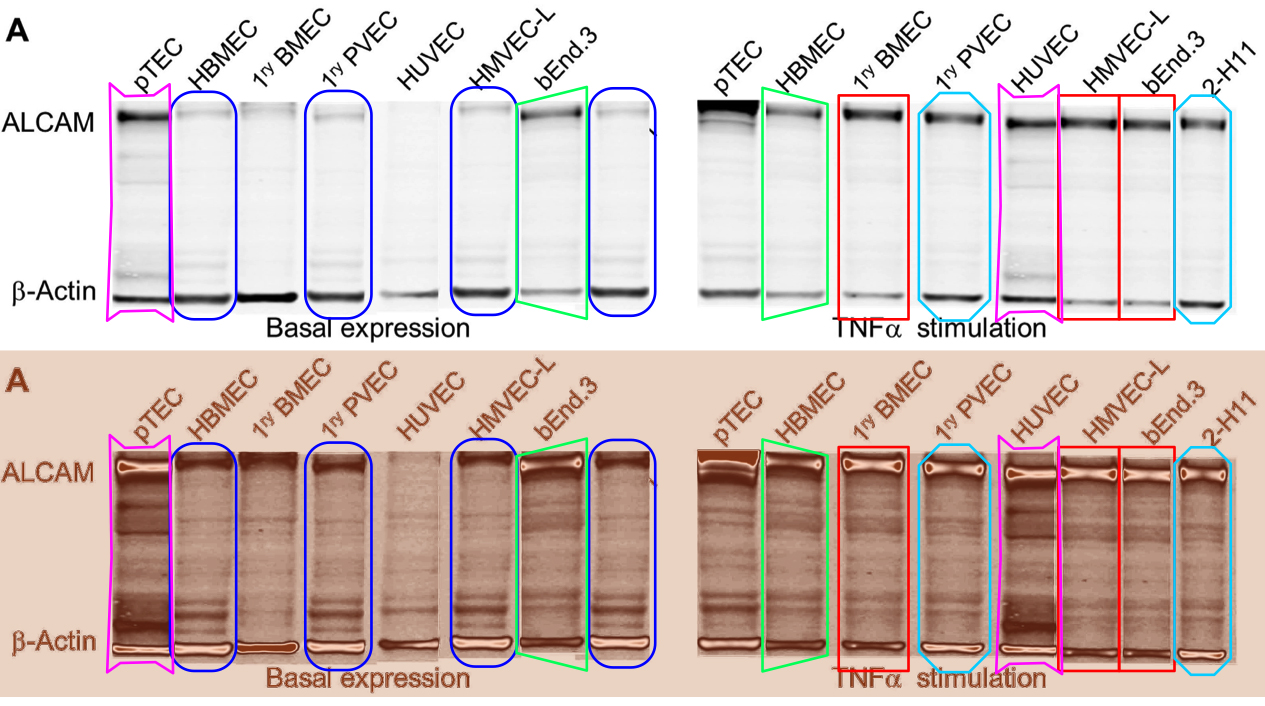
'Salsola Zygophylla' preferred to regroup the lanes to show their family relationships.
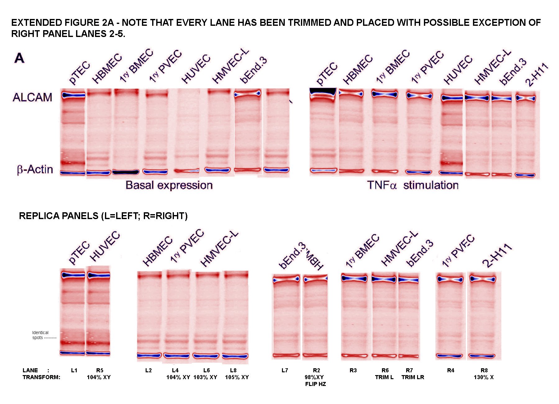
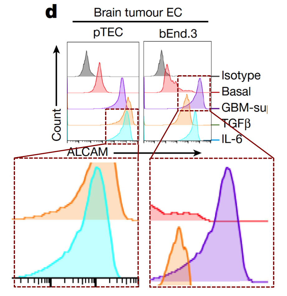
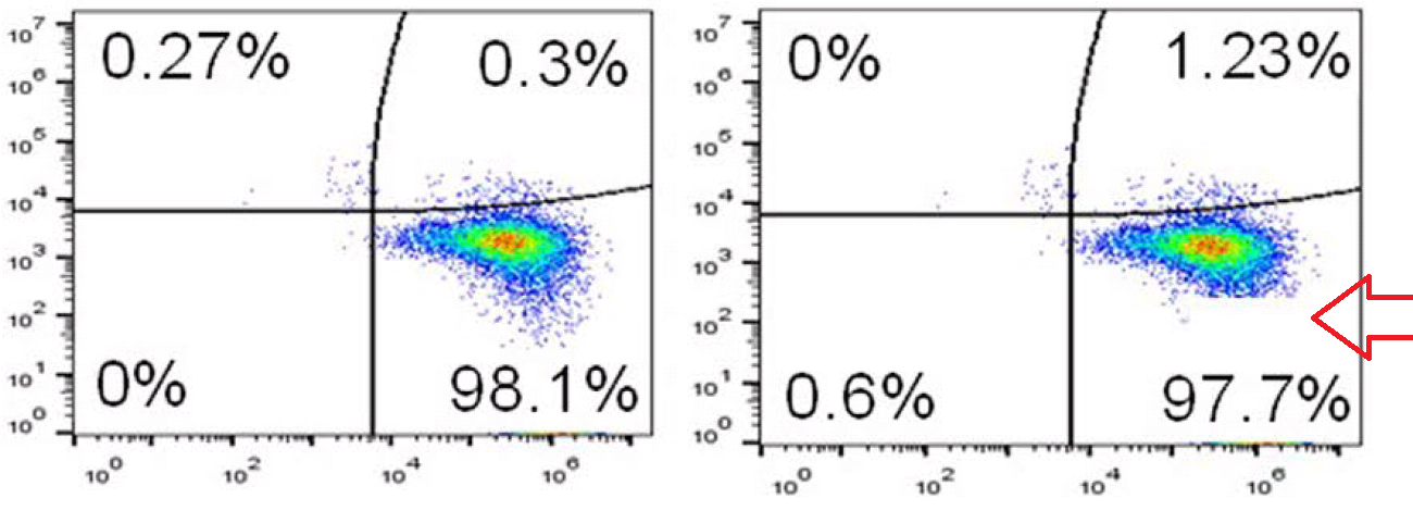
Any attempt to redesign T-cell signalling will involve flow cytometry and FACS plots: histograms (or two-dimensional distributions) of how many cells are found with different levels of some protein (or proteins) expressed on the outside of their cell membranes. Cells of the desired kind are cultured under the desired conditions, and decorated with fluorescent flags attached to those proteins so that they can be measured and counted as they are pumped down a narrow pipeline.
If identical histograms result from completely different cell lines, treated in different ways, then Houston we have a problem.

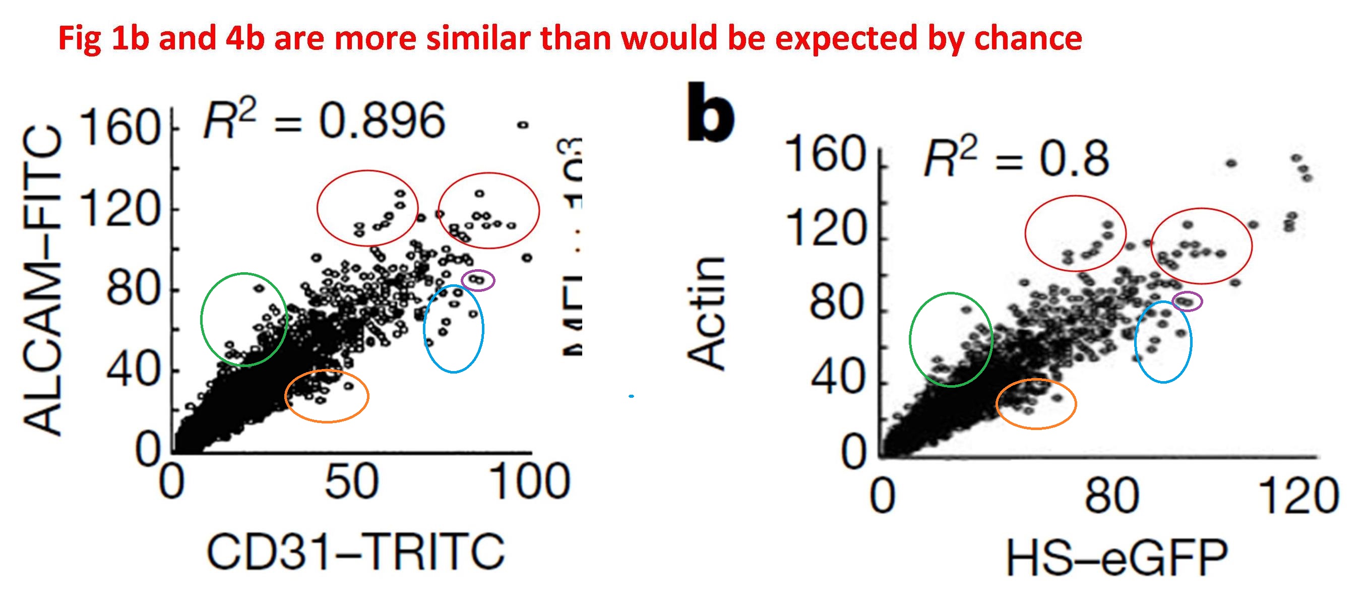
At left below is G. Purpureosquamulosus' original observation of identical two-dimensional cell-count plots in Figure 6A. At right is an extension from 'Pseudonocardia Adelaidensis', where certain plots have been coloured either red or blue, and then overlapped with semi-transparency, so that dots (cells) with identical protein levels (coordinates) in both plots appear as purple.


When more points overlap than chance could explain -- the vast majority of points, perhaps -- this could be a clue that both plots come from the same raw file of flow-cytometry data, but with different "gating" parameters for excluding spurious signals.
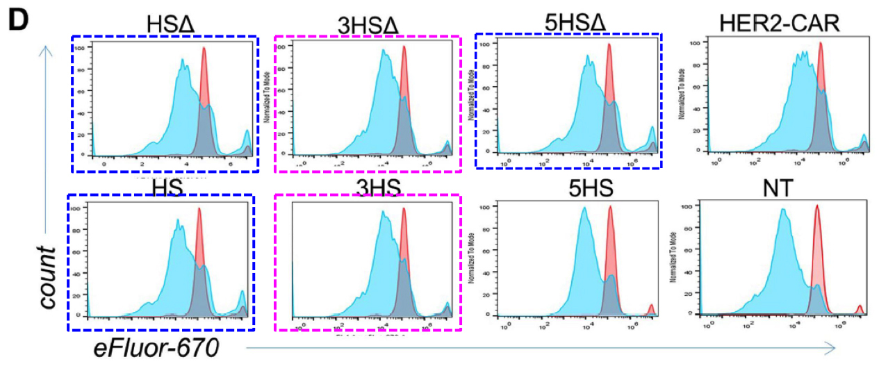
While on the topic of raw data, we have already noted the admirable trend to provide or link to raw data. This opens up new possibilities for colour-coding, as here for the Source Data for Figs 4c and 4d, to emphasise values which appear (a) unexpectedly often, or (b) in parallel between columns that come from different experiments and should be independent.
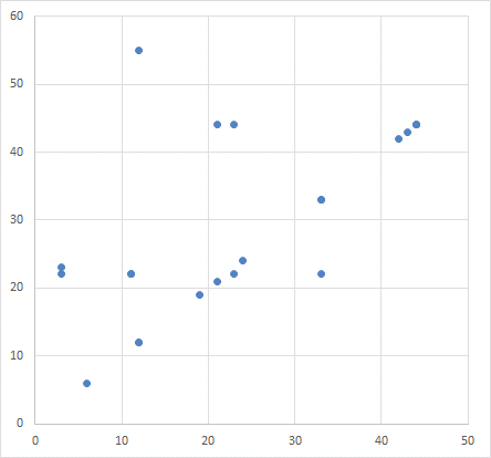
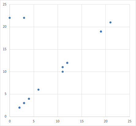
Which reminds me of how a scatter-plot appears twice in the paper, illustrating different associations between protein expression. Somehow the same distribution of points is summed up by two different correlations.
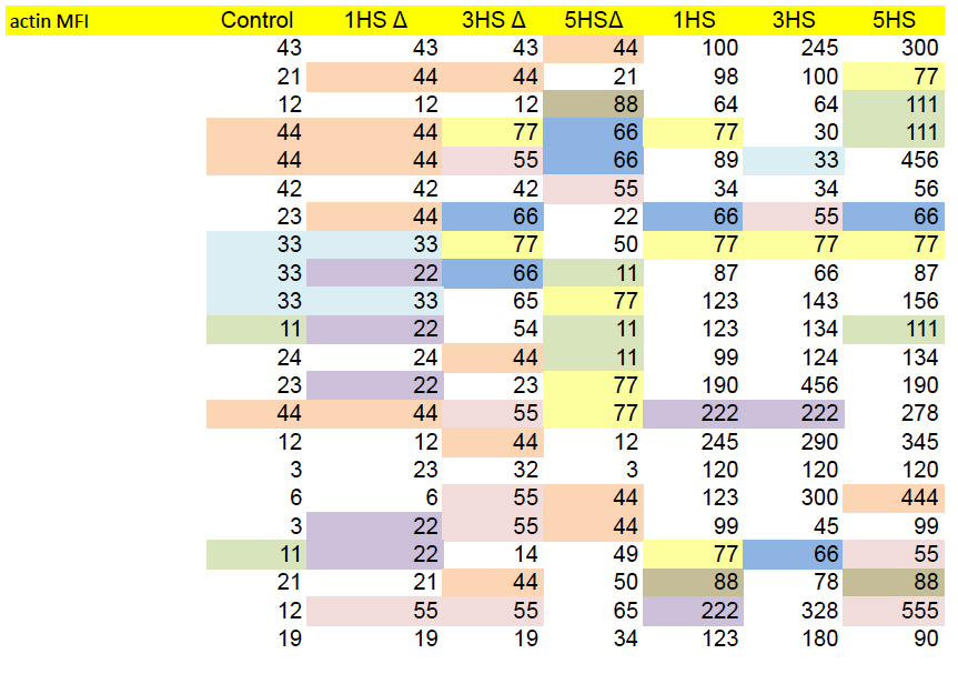
In Figures 4g and S5d, each panel is a kind of distribution of distributions. The goal is a statistical comparison, within each panel, between the populations of normal, control T-cells and altered, HS-expressing cells -- the left-hand and right-hand columns respectively.
g, Characterization of migrating T cells through collective quantification of actin MFI, focal adhesions, area of spreading, and podosynapse formation by high-throughput deconvolution microscopy at HS–ALCAM interface in a representative donor (n = 200–800 cells per condition). Each column represents cells in one well.

These repetitions are glaringly obvious once they have been pointed out. They are impossible to unsee. It is tempting to criticise the reviewers, and the authors of the approbative side-columns in Nature, for not spotting them... they should be looking at themselves and thinking about their poor life choices. But we need to ask ourselves here, "Would I have done any better without image-enhancement and prompting and priming?" For we do not all have Terminator Vision.

I have hardly started on the bewildering succession of enhanced and highlighted diagrams within that PubPeer thread. You should read the whole thing; it will help you imagine the plight of the peer-reviewers, confronted with a bewildering succession of diagrams in the original manuscript.
Data malfeasance is not a new phenomenon, of course. It may or may not be encouraged by the new possibilities of digital publication... or by a third trend, where funding bodies are encouraging researchers to network themselves into large-scale collaborations across institutions and across countries. This is just a particularly high-profile case, thanks to the publisher's decision to broadcast the paper through press releases and science churnalists.
We eagerly await the outcome of the editorial investigation into the paper's integrity (announced on October 25), to see who will be singled out as a scapegoat. It is hard to believe that a single rogue author could have faked so many different modes of data collection / presentation.
No comments:
Post a Comment