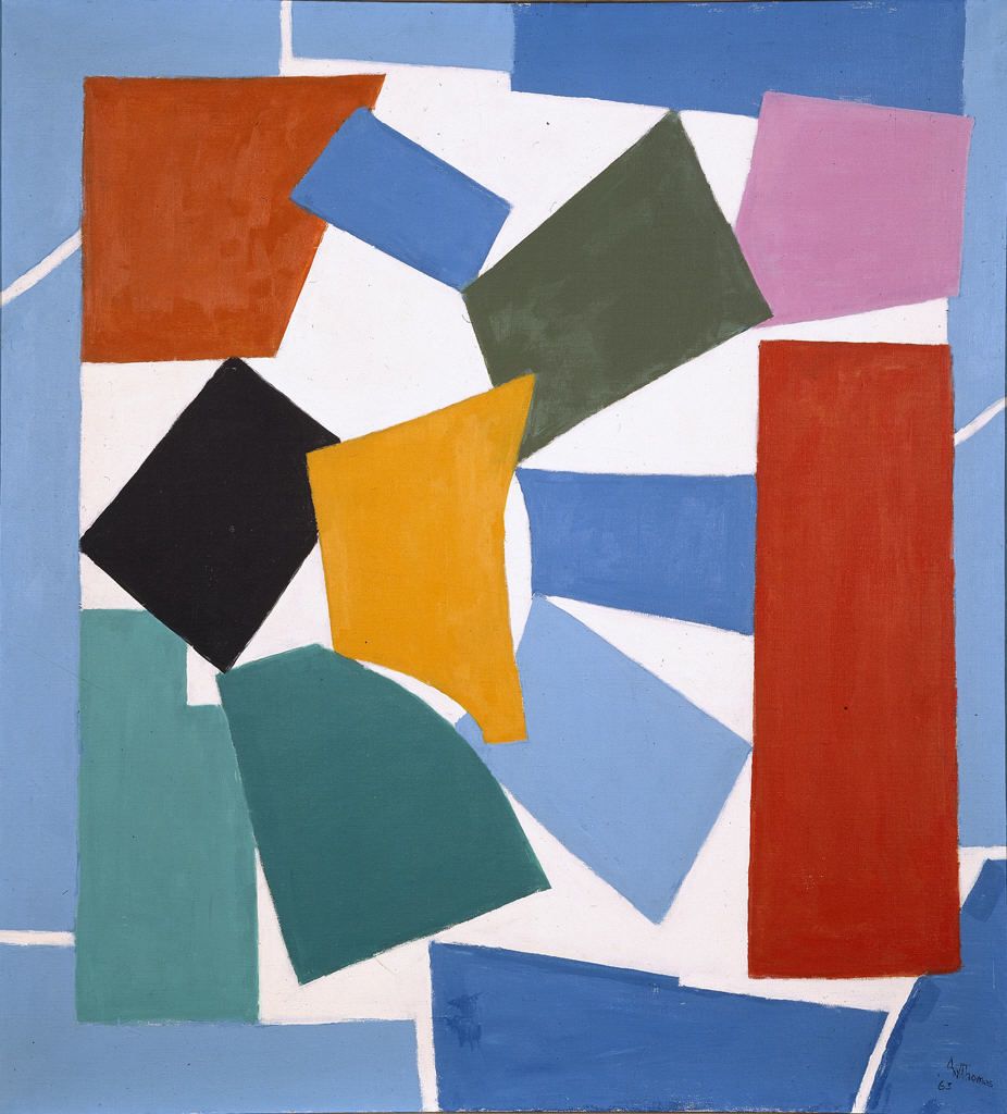
 "What's this on the fridge door?" I called out from the tea-room, in a querulous voice on account of it covering up the helpful and instructive "Open This Side" sign.
"That's the new dietary guideline chart," said tigris, "just delivered this morning by Dr Benway the Riddled staff doctor -- 'Early retirement is not the same as deregistration' -- and purveyor of veterinary advice (ask about this week's special on Blue Magic). Each blotch is a different food source."
"It is an homage to Matisse's decoupage The Snail," vouchsafed Another Kiwi.
"Please do not say 'An homage'", I begged him; "it gives me an headache. Also, what happened to the old guideline chart?"
 "That was the 2005 version," AK explained, "and according to Dr Walter C. Willett, it 'basically conveys no useful information'. I have been reading an history of the subject."
Oh how we laughed at the thought that the new version does convey any useful information. Then I gave up trying to open the fridge and made do with an unchilled bottle from the cupboard.
According to Dr Robert C. Post [deputy director of the Department of Agriculture’s Center for Nutrition Policy and Promotion], the logo is intended more to make consumers "a little more concerned about what [they] choose to build a healthy day’s diet.”Apparently people are not sufficiently anxious about food at the moment.
Dr. Post said the U.S.D.A. had spent about $2 million to develop and promote the logo, including conducting research and focus groups and creating a Web site.(1) If the Department of Agriculture is in charge of providing your nutritional advice, you're basically fucked. You might as well advertise for a cat to guard your henhouse while you're at it. Or a fox to guard the pigeons, something like that.
(2) If New Zealand had applied the same policy to tobacco then the media would still be full of well-funded advertising campaigns encouraging consumers to smoke themselves to death, but each packet of tobacco products would carry a little colour-coded logo on the side showing how a well-balanced regime of nicotine consumption would consist of 25% cigarettes, 25% pipes and cigars, 25% snuff and chewing tobacco and 25% nicotine patches & gum.

12 comments:
I too am busily encouraging consumers to smoke themselves to death.
Look at all the choices!
There's many different ways for one to smoke one's self to death.
~
choose to build a healthy day’s diet.
where do the brown liguors fit in?
Silly me, I think read the chart too literally. The paper diet is now OVER.
Me, I'm heading to the propumat.
where do the brown liguors fit in?
In my experience there is never a problem with lack of space.
I KNEW somebody would bring that one home.
where do the brown liguors fit in?
Stupidly, the dietary guidelines don't cover booze.
...the dietary guidelines don't cover booze
everything not forbidden is permitted
If you don't have a permit, you're likely to be towed.
~
"where do the brown liguors fit in?"
Cocktail rings?
I would like to toad-eyed tonight...
If you don't have a permit, you're likely to be towed.
The Topless Towers of Illium are on the way!
Post a Comment